User Targeted Functional Web Design
User targeted functional web design, enables you to understand the importance of having a results driven website. If you take functional web design and enhance it with great UX (user experience) – this mix will elevate your website to the next level. Businesses should always aim to build a functional website which then converts visitors into sales. You can achieve this yourself with good support.
If you’ve already read the article on functional web design and identified the purpose of your visitors, then you might be ready to learn how you can apply this to your industry and your audience. It’s a simple science, here are some tips on how to design a website targeted specifically for your users.
Users are key to your business
Firstly, the website needs to demonstrate understanding of the person who is most likely to be using it – “the USER”. The user should always be at the forefront of your website design, when you think about design or function. You could ask yourself questions like:
- Who are you selling to?
- How do they like to interact with you?
- How old are they?

When building a website there are many factors to think about and it can become overwhelming, for example tone of voice, colour schemes, white space, image styles, page length, movement, modernity – and the list goes on. Consider the user at this stage and you will be pleasantly surprised by your success.
It is important to realise that, should you get this wrong your customer will be less likely to return to your website, unless of course your product is outstanding, and they cannot get it elsewhere.
Your user is the KEY to your business. If your key doesn’t fit in the lock you provide it won’t unlock your brand potential.
Website Design for Devices, Browsers and SEO
When considering your user, you should also pause to think about how and when they are likely to browse your website. What are the typical habits of your audience? How do they currently interact with your brand?
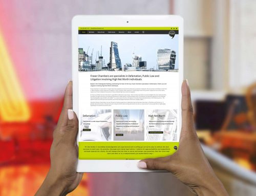
Put yourselves in their shoes – are they more likely to be chilling on the sofa scrolling through on their iPad or tablet, out for a coffee and using their phone for browsing or on a laptop perhaps at their desk?
Some website designs can break when you test across platforms and browsers – this can sometimes have limitations on how creative you can be. The best solution to combat this problem is to consider your users and to focus on the medium they typically use, thus providing them with the best user experience – it’ll keep them returning to your website.
Don’t forget that if your website isn’t currently “mobile friendly” that your search ability will be greatly compromised by the search engines who index mobile first. Perhaps we will cover this is a future article, for now if you need help with this, please get in touch.
Page speeds impact user experience
There is nothing more frustrating for a user than when a website takes an absolute age to load. More often than not websites which look cool, have huge amounts of imagery or have over the top functionality struggle with loading speeds. The reality is when a website page takes a long time to load, web users tend to give up and go elsewhere (also known as a high bounce rate) – unless of course the need outweighs their patience.
If you are experiencing page load issues or want to avoid such issues, two simple things you can do is to optimise image sizes for web and cut back on unnecessary functionality – this will help to reduce how long it takes the user to load the page.
In summary
A successful website is a delicate balance of function, usability and design.
Look good, be functional, discard over the top design and encourage users to return by fulfilling their propose for visiting… simple! If you think our services could help you move your business in the right direction, please contact us.
GET IN
TOUCH.


